This notebook shows how to do gene regulatory analysis for scRNA-Seq dataset using SCENIC. The example data used in this notebook is the PBMC4k dataset downloaded from 10xGenomics
SCENIC package allows users to characterize the single-cell gene regulatory network interference and cluster cell by set of regulons. Below is the main steps in SCENIC workflow:
Building the gene regulatory network (GRN):
a. Identify potential targets for each TF based on co-expression.
- Filtering the expression matrix and running GENIE3/GRNBoost.
- Formatting the targets from GENIE3/GRNBoost into co-expression modules.
b. Select potential direct-binding targets (regulons) based on DNA-motif analysis (RcisTarget: TF motif analysis)
Identify cell states and their regulators:
c. Analyzing the network activity in each individual cell (AUCell)
- Scoring regulons in the cells (calculate AUC)
- Optional: Convert the network activity into ON/OFF (binary activity matrix)
d. Identify stable cell states based on their gene regulatory network activity (cell clustering) and exploring the results.
Load required packages
import os, sys, glob, pickle
import operator as op
import pandas as pd
import seaborn as sns
import numpy as np
import scanpy as sc
import loompy as lp
import matplotlib as mpl
import matplotlib.pyplot as plt
from matplotlib.pyplot import rc_context
from pyscenic.export import add_scenic_metadata
from pyscenic.utils import load_motifs
from pyscenic.transform import df2regulons
from pyscenic.binarization import binarize
from pyscenic.rss import regulon_specificity_scores
from pyscenic.plotting import plot_binarization, plot_rss
from IPython.display import HTML, display
Set some settings for Scanpy about verbosity and the figure size
sc.set_figure_params(dpi=150, fontsize=10, dpi_save=600)
sc.settings.njobs = 16
Data preprocessing
Get the expression data
os.system('wget https://cf.10xgenomics.com/samples/cell-exp/2.1.0/pbmc4k/pbmc4k_filtered_gene_bc_matrices.tar.gz')
os.system('tar -xvzf pbmc4k_filtered_gene_bc_matrices.tar.gz')
adata = sc.read_10x_mtx(
'./filtered_gene_bc_matrices/GRCh38/' ,
var_names='gene_symbols',
)
Filter low-quality cells
# simply compute the number of genes per cell (computers 'n_genes' column)
sc.pp.filter_cells(adata, min_genes=0)
# for each cell compute fraction of counts in mito genes versus all genes
mito_genes = adata.var_names.str.startswith('MT-')
adata.obs['percent_mito'] = np.sum(
adata[:, mito_genes].X, axis=1).A1 / np.sum(adata.X, axis=1).A1
# add the total counts per cell as observations-annotation to adata
adata.obs['n_counts'] = adata.X.sum(axis=1).A1
# initial cuts
sc.pp.filter_cells(adata, min_genes=200)
adata = adata[adata.obs['n_genes'] < 5000, :]
adata = adata[adata.obs['percent_mito'] < 0.15, :]
adata
Basic pre-processing
# save a copy of the raw data
adata.raw = adata
# Total-count normalize (library-size correct) to 10,000 reads/cell
sc.pp.normalize_per_cell(adata, counts_per_cell_after=1e4)
# log transform the data.
sc.pp.log1p(adata)
# identify highly variable genes.
sc.pp.highly_variable_genes(adata, min_mean=0.0125, max_mean=3, min_disp=0.5)
# keep only highly variable genes:
adata = adata[:, adata.var['highly_variable']]
# regress out total counts per cell and the percentage of mitochondrial genes expressed
sc.pp.regress_out(adata, ['n_counts', 'percent_mito'])
# scale each gene to unit variance, clip values exceeding SD 10.
sc.pp.scale(adata, max_value=10)
adata
We write the basic filtered expression matrix to a loom file. This will be used in the command-line pySCENIC steps
# create basic row and column attributes for the loom file:
row_attrs = {
'Gene': np.array(adata.var_names),
}
col_attrs = {
'CellID': np.array(adata.obs_names),
'nGene': np.array(np.sum(adata.X.transpose() > 0, axis=0)).flatten(),
'nUMI': np.array(np.sum(adata.X.transpose(), axis=0)).flatten(),
}
lp.create('./pbmc4k.loom', adata.X.transpose(), row_attrs, col_attrs)
Perform dimensionality reduction and clustering
sc.tl.pca(adata, svd_solver='arpack')
# neighborhood graph of cells (determine optimal number of PCs here)
sc.pp.neighbors(adata, n_neighbors=15, n_pcs=30)
# compute tSNE
sc.tl.tsne(adata)
# cluster the neighbourhood graph
sc.tl.louvain(adata, resolution=0.4)
sc.pl.tsne(adata, color=['louvain'])

Cell type labeling
with rc_context({'figure.figsize': (2, 2)}):
sc.pl.tsne( adata, color=[
'IL7R', 'CCR7', 'CD14', 'LYZ', 'S100A4', 'MS4A1', 'CD8A',
'FCGR3A', 'MS4A7', 'GNLY', 'NKG7', 'FCER1A', 'CST3', 'PPBP'
], ncols=3, color_map='YlOrRd', alpha=1, size=10)

We follow the tutorial from Seurat pbmc3k clustering and Scanpy pbmc3k clustering to label the cell types for this dataset.
adata.obs['celltype'] = adata.obs['louvain']
new_cluster_names = [
'CD4 T', 'CD14 Monocytes', 'B', 'NK1', 'CD8 T',
'Naive T cell', 'NK2','Dendritic', 'FCGR3A Monocytes', 'Unknown'
]
adata.rename_categories('celltype', new_cluster_names)
sc.pl.tsne(adata, color=['celltype'])

SCENIC analysis
STEP 1: Gene regulatory network inference, and generation of co-expression modules
Phase Ia: GRN inference using the GRNBoost2 algorithm
For this step we use the cli version of pySCENIC. We use the counts matrix (without log transformation or further processing) from the loom file we wrote earlier.
Output: List of adjacencies between a TF and its targets stored in ADJACENCIES_FNAME.
Download the list of human transcription factors
os.system('wget https://raw.githubusercontent.com/aertslab/pySCENIC/master/resources/lambert2018.txt')
Let's load all transcription factors in the list and see if they are in the highly-variable gene list
tf = pd.read_csv('lambert2018.txt', header=None)
tf
hvg = np.array(adata.var.index)
expressed_tfs = []
for t in np.array(tf[0]):
if t in hvg:
expressed_tfs.append(t)
print('Number of highly variable transcription factors', len(expressed_tfs))
Save list of highly variable transcription factors
with open('hv_tfs_pbmc4k.txt', 'w') as f:
f.write('\n'.join(expressed_tfs))
Set the PATH variable to get the pyscenic cli
os.environ['PATH'] = os.path.dirname(sys.executable) + ':' + os.environ['PATH']
os.system('pyscenic grn ./pbmc4k.loom ./hv_tfs_pbmc4k -o adj.csv --num_workers 14')
Read in the adjacencies matrix:
adjacencies = pd.read_csv('adj.csv', index_col=False, sep=',')
adjacencies.head()
STEP 2-3: Regulon prediction aka cisTarget from CLI
For this step the CLI version of SCENIC is used. This step can be deployed on an High Performance Computing system.
Output: List of adjacencies between a TF and its targets stored in MOTIFS_FNAME.
locations for ranking databases, and motif annotations:
Download the motif database, motifs-v9-nr.hgnc-m0.001-o0.0.tbl. And the sequence data of human genes hg38__refseq-r80__500bp_up_and_100bp_down_tss.mc9nr.feather
os.sys('wget -O hg38__refseq-r80__500bp_up_and_100bp_down_tss.mc9nr.feather https://www.dropbox.com/s/drpobsb3ipb98h5/hg38__refseq-r80__500bp_up_and_100bp_down_tss.mc9nr.feather?dl=1')
os.system('wget -O motifs-v9-nr.hgnc-m0.001-o0.0.tbl https://www.dropbox.com/s/ejqytwyka3ixcir/motifs-v9-nr.hgnc-m0.001-o0.0.tbl?dl=1')
import glob
# ranking databases
f_db_glob = '*feather'
f_db_names = ' '.join( glob.glob(f_db_glob) )
f_db_names
Run the Regulon prediction command
Here, we use the --mask_dropouts option, which affects how the correlation between TF and target genes is calculated during module creation. It is important to note that prior to pySCENIC v0.9.18, the default behavior was to mask dropouts, while in v0.9.18 and later, the correlation is performed using the entire set of cells (including those with zero expression). When using the modules_from_adjacencies function directly in python instead of via the command line, the rho_mask_dropouts option can be used to control this.
os.system('pyscenic ctx adj.csv {} --annotations_fname ./motifs-v9-nr.hgnc-m0.001-o0.0.tbl --expression_mtx_fname ./pbmc4k.loom --output reg.csv --mask_dropouts --num_workers 20'.format(f_db_names))
The results is a list of enriched motifs for the modules.
| Column name | Description |
|---|---|
| TF | Transcription Factor (TF) for which an enriched motif is discovered. |
| motifID | The identifier of the enriched motif. |
| AUC | Area Under the recovery Curve statistic for this enriched motif. |
| NES | Normalized Enrichment Score for this enriched motif. |
| Context | Collection of tags clarifying the origin of the module for this factor: e.g. ranking database, ... |
| Annotation | Verbose description of the annotation available for this motif. |
| MotifSimilarityQvalue | The TomTom derived Q-value for motif similarity (if used for assigning the factor to this enriched motif). |
| OrthologousIdentity | The Amino Acid Identity between factors (if used for assigning the factor to this enriched motif). |
| RankAtMax | The position of the Leading Edge which is used as a threshold on the whole genome ranking of the motif to decide if a gene in the input is a direct target of a TF that binds this motif. |
| TargetGenes | A list of pairs: genes and their associated weights from GENIE3/GRNBoost2. |
Read the TF-motif results
df_motifs = load_motifs('./reg.csv')
df_motifs.head()
Let's try embeded the motif logo of all regulon into the dataframe
BASE_URL = 'http://motifcollections.aertslab.org/v9/logos/'
COLUMN_NAME_LOGO = 'MotifLogo'
COLUMN_NAME_MOTIF_ID = 'MotifID'
COLUMN_NAME_TARGETS = 'TargetGenes'
FIGURES_FOLDERNAME = './figures/'
### Set up some helper functions first
def savesvg(fname: str, fig, folder: str=FIGURES_FOLDERNAME) -> None:
"""
Save figure as vector-based SVG image format.
"""
fig.tight_layout()
fig.savefig(os.path.join(folder, fname), format='svg')
def display_logos(df: pd.DataFrame, top_target_genes: int = 3, base_url: str = BASE_URL):
"""
:param df:
:param base_url:
"""
# Make sure the original dataframe is not altered.
df = df.copy()
# Add column with URLs to sequence logo.
def create_url(motif_id):
return '<img src="{}{}.png" style="max-height:124px;"></img>'.format(base_url, motif_id)
df[("Enrichment", COLUMN_NAME_LOGO)] = list(map(create_url, df.index.get_level_values(COLUMN_NAME_MOTIF_ID)))
# Truncate TargetGenes.
def truncate(col_val):
return sorted(col_val, key=op.itemgetter(1))[:top_target_genes]
df[("Enrichment", COLUMN_NAME_TARGETS)] = list(map(truncate, df[("Enrichment", COLUMN_NAME_TARGETS)]))
MAX_COL_WIDTH = pd.get_option('display.max_colwidth')
pd.set_option('display.max_colwidth', -1)
display(HTML(df.head().to_html(escape=False)))
pd.set_option('display.max_colwidth', MAX_COL_WIDTH)
display_logos(df_motifs.head())
| Enrichment | ||||||||||
|---|---|---|---|---|---|---|---|---|---|---|
| AUC | NES | MotifSimilarityQvalue | OrthologousIdentity | Annotation | Context | TargetGenes | RankAtMax | MotifLogo | ||
| TF | MotifID | |||||||||
| ATF3 | dbcorrdb__CEBPD__ENCSR000BQJ_1__m1 | 0.083382 | 3.808435 | 0.000001 | 1.0 | motif similar to dbcorrdb__ATF3__ENCSR000BNU_1__m1 ('ATF3 (ENCSR000BNU-1, motif 1)'; q-value = 1.45e-06) which is directly annotated | (hg38__refseq-r80__500bp_up_and_100bp_down_tss.mc9nr, activating, weight>75.0%) | [(ATF3, 1.0), (NEAT1, 1.0447401413985318), (GABARAP, 1.060969255395327)] | 1568 | 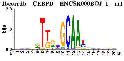 |
| cisbp__M0314 | 0.077860 | 3.376442 | 0.000052 | 1.0 | motif similar to factorbook__CREB ('CREB'; q-value = 5.21e-05) which is directly annotated | (hg38__refseq-r80__500bp_up_and_100bp_down_tss.mc9nr, activating, weight>75.0%) | [(ATF3, 1.0), (RETN, 1.0312089031247464), (NEAT1, 1.0447401413985318)] | 4550 | 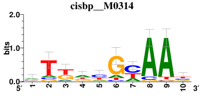 |
|
| transfac_pro__M07414 | 0.094758 | 4.698509 | 0.000972 | 1.0 | motif similar to factorbook__CREB ('CREB'; q-value = 0.000972) which is directly annotated | (hg38__refseq-r80__500bp_up_and_100bp_down_tss.mc9nr, activating, weight>75.0%) | [(ATF3, 1.0), (GABARAP, 1.060969255395327), (CSTA, 1.064965479804881)] | 1505 | ||
| cisbp__M0326 | 0.078454 | 3.422876 | 0.000832 | 1.0 | motif similar to factorbook__CREB ('CREB'; q-value = 0.000832) which is directly annotated | (hg38__refseq-r80__500bp_up_and_100bp_down_tss.mc9nr, activating, weight>75.0%) | [(ATF3, 1.0), (NEAT1, 1.0447401413985318), (GABARAP, 1.060969255395327)] | 2260 |  |
|
| BCL11A | cisbp__M4475 | 0.096300 | 5.628151 | 0.000000 | 1.0 | gene is annotated for similar motif cisbp__M4453 ('BCL11A[gene ID: "ENSG00000119866" species: "Homo sapiens" TF status: "direct" TF family: "C2H2 ZF" DBDs: "zf-C2H2"]; BCL11B[gene ID: "ENSG00000127152" species: "Homo sapiens" TF status: "inferred" TF family: "C2H2 ZF" DBDs: "zf-C2H2"]; Bcl11a[gene ID: "ENSMUSG00000000861" species: "Mus musculus" TF status: "inferred" TF family: "C2H2 ZF" DBDs: "zf-C2H2"]; Bcl11b[gene ID: "ENSMUSG00000048251" species: "Mus musculus" TF status: "inferred" TF family: "C2H2 ZF" DBDs: "zf-C2H2"]'; q-value = 6.32e-14) | (hg38__refseq-r80__500bp_up_and_100bp_down_tss.mc9nr, activating, weight>75.0%) | [(ENTPD1, 1.1548777195742543), (SPI1, 1.1968982137430095), (SCIMP, 1.254032449123743)] | 3093 | 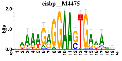 |
We convert the motif dataframe into a list of regulons for further analysis
regulons = df2regulons(df_motifs)
# Pickle these regulons.
with open('./regulons.pkl', 'wb') as f:
pickle.dump(regulons, f)
How to display one motif logo
def fetch_logo(regulon, base_url = BASE_URL):
for elem in regulon.context:
if elem.endswith('.png'):
return '<img src="{}{}" style="max-height:124px;"></img>'.format(base_url, elem)
return ""
Create a regulon dataframe with the motif logo included
df_regulons = pd.DataFrame(data=[
list(map(op.attrgetter('name'), regulons)),
list(map(len, regulons)),
list(map(fetch_logo, regulons))
], index=['name', 'count', 'logo']).T
### Replace this by your TF name
SELECTED_TF = 'IRF8(+)'
MAX_COL_WIDTH = pd.get_option('display.max_colwidth')
pd.set_option('display.max_colwidth', -1)
display(HTML(df_regulons[df_regulons.name == SELECTED_TF].to_html(escape=False)))
pd.set_option('display.max_colwidth', MAX_COL_WIDTH)
| name | count | logo | |
|---|---|---|---|
| 16 | IRF8(+) | 300 | 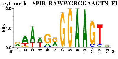 |
STEP 4: Cellular enrichment (aka AUCell) from CLI
We use AUCell package to explore whether a given gene set is active/inactive in a particular cell. In one cell, AUCell ranks the genes expressed in that cell by the expression values, genes that have the same expression value will be shuffled. Then it goes from the 1st rank gene (highest expression) to least ranked gene and keep track of how many genes in the given set appear respectively. For more information, please refer to AUCell
os.system('pyscenic aucell ./pbmc4k.loom reg.csv --output ./pyscenic_output.loom --num_workers 20')
Read the aucell results as a matrix
# collect SCENIC AUCell output
lf = lp.connect('pyscenic_output.loom', mode='r+', validate=False)
auc_mtx = pd.DataFrame(lf.ca.RegulonsAUC, index=lf.ca.CellID)
lf.close()
auc_mtx
Visualization of SCENIC's AUC matrix
Create heatmap with binarized regulon activity.
For a given gene set, cells that have higher AUC score might be in the 'active' state of that gene set. In the ideal situation, we would have a bi-modal distribution of AUC score of all cells, where active cells are separated by inactive cells.
In the steps below, we will use the function binarize in the module pyscenic.binarization to compute the AUC threshold of each gene set to determine the active/inactive state of each cell. But, determining whether the signature is active (or not) in a given cell is not always trivial, please refer here to find more information about this step AUCell
Compute the on/off thresholds for each regulon
bin_mtx, thresholds = binarize(auc_mtx)
thresholds.to_frame().rename(columns={0:'threshold'}).to_csv('onoff_thresholds.csv')
Draw the AUC score distribution with the threshold included
fig, ((ax1, ax2, ax3)) = plt.subplots(1, 3, figsize=(8, 4), dpi=100)
plot_binarization(auc_mtx, 'PAX5(+)', thresholds['PAX5(+)'], ax=ax1)
plot_binarization(auc_mtx, 'IRF8(+)', thresholds['IRF8(+)'], ax=ax2)
plot_binarization(auc_mtx, 'POU2AF1(+)', thresholds['POU2AF1(+)'], ax=ax3)
plt.tight_layout()

The helper function to draw the cell type color palette
def palplot(pal, names, colors=None, size=1):
n = len(pal)
f, ax = plt.subplots(1, 1, figsize=(n * size, size))
ax.imshow(np.arange(n).reshape(1, n),
cmap=mpl.colors.ListedColormap(list(pal)),
interpolation="nearest", aspect="auto")
ax.set_xticks(np.arange(n) - .5)
ax.set_yticks([-.5, .5])
ax.set_xticklabels([])
ax.set_yticklabels([])
colors = n * ['k'] if colors is None else colors
for idx, (name, color) in enumerate(zip(names, colors)):
ax.text(0.0+idx, 0.0, name, color=color, horizontalalignment='center', verticalalignment='center')
return f
N_COLORS = len(adata.obs.celltype.dtype.categories)
COLORS = [color['color'] for color in mpl.rcParams["axes.prop_cycle"]]
### black/white palette
cell_type_color_lut = dict(zip(adata.obs.celltype.dtype.categories, COLORS))
bw_palette = sns.xkcd_palette(['white', 'black'])
### cell type color palette
sns.set()
sns.set(font_scale=0.8)
fig = palplot(sns.color_palette(COLORS), adata.obs.celltype.dtype.categories, size=2.0)

Map cell ID to cell type
cell_id2cell_type_lut = adata.obs['celltype'].to_dict()
cell_id2cell_type_lut
The cluster heatmap function
sns.set()
sns.set(font_scale=1.0)
sns.set_style('ticks', {'xtick.minor.size': 1, 'ytick.minor.size': 0.1})
g = sns.clustermap(bin_mtx.T,
col_colors=auc_mtx.index.map(cell_id2cell_type_lut).map(cell_type_color_lut),
cmap=bw_palette, figsize=(20,20))
g.ax_heatmap.set_xticklabels([])
g.ax_heatmap.set_xticks([])
g.ax_heatmap.set_xlabel('Cells')
g.ax_heatmap.set_ylabel('Regulons')
g.ax_col_colors.set_yticks([0.5])
g.ax_col_colors.set_yticklabels(['Cell Type'])
g.cax.set_visible(False)

On the heatmap, we can see that cell types are clustered by the regulon activity, which can be considered as the transcription program of each cell type
Create new tSNE embedding on regulon activity space
Since we gonna replace the current tSNE coordinates, we save the current t-SNE embedding for further analysis.
embedding_pca_tsne = pd.DataFrame(adata.obsm['X_tsne'], columns=[['_X', '_Y']], index=adata.obs_names)
We add all metadata derived from SCENIC to the scanpy.AnnData object.
add_scenic_metadata(adata, auc_mtx, regulons)
Current adata
adata
AUCELL + tSNE PROJECTION
We change the tSNE projection so that it relies on AUCell instead of PCA.
sc.tl.tsne(adata, use_rep = 'X_aucell')
Now we plot the new tSNE and color by cell types
sc.pl.tsne(adata, color = 'celltype')

As we can see from the plot, T-cell populations (Naive, CD4, and CD8) are mixed with the NK populations. Myeloid dervied cell population like Monocytes and Dendritic are mixed together. B cell population are splitted into two sub-populations
Cell type specific regulators - RSS
rss = regulon_specificity_scores(auc_mtx, adata.obs.celltype)
rss
Now we plot the Regulon specific score for all cell types to see if there is any Transcription factors that is specific for a particular cell type
sns.set()
sns.set(style='whitegrid', font_scale=0.7)
fig, ((ax1, ax2), (ax3, ax4)) = plt.subplots(2, 2, figsize=(8, 6))
plot_rss(rss, 'B', ax=ax1)
ax1.set_xlabel('')
plot_rss(rss, 'CD4 T', ax=ax2)
ax2.set_xlabel('')
ax2.set_ylabel('')
plot_rss(rss, 'CD14 Monocytes', ax=ax3)
ax3.set_xlabel('')
ax3.set_ylabel('')
plot_rss(rss, 'Naive T cell', ax=ax4)

sns.set()
sns.set(style='whitegrid', font_scale=0.8)
fig, ((ax5, ax6, ax7), (ax8, ax9, ax10)) = plt.subplots(2, 3, figsize=(8, 6))
plot_rss(rss, 'CD8 T', ax=ax5)
plot_rss(rss, 'Dendritic', ax=ax6)
plot_rss(rss, 'NK1', ax=ax7)
plot_rss(rss, 'NK2', ax=ax8)
plot_rss(rss, 'FCGR3A Monocytes', ax=ax9)
plot_rss(rss, 'Unknown', ax=ax10)
plt.tight_layout()

Cell type specific regulators - Z-score
Another way to find cell type specific regulators is to use a Z score (i.e. the average AUCell score for the cells of a give type are standardized using the overall average AUCell scores and its standard deviation).
df_obs = adata.obs
signature_column_names = list(df_obs.select_dtypes('number').columns)
signature_column_names = list(filter(lambda s: s.startswith('Regulon('), signature_column_names))
df_scores = df_obs[signature_column_names + ['celltype']]
df_results = ((df_scores.groupby(by='celltype').mean() - df_obs[signature_column_names].mean())/ df_obs[signature_column_names].std()).stack().reset_index().rename(columns={'level_1': 'regulon', 0:'Z'})
df_results['regulon'] = list(map(lambda s: s[8:-1], df_results.regulon))
Let see the top results of B cells
df_Bresults = df_results[df_results['celltype'] == 'B']
df_Bresults.sort_values('Z', ascending=False).head()
The table shows the top transcription factors of B cells is IRF8, PAX5, and IRF7. We plot the activities of IRF8 and PAX5 and IRF7 on the tSNE plot to test if we can see any distinct pattern for B cells
sc.pl.tsne(adata, color = ['celltype', 'Regulon(PAX5(+))', 'Regulon(REL(+))', 'Regulon(POU2AF1(+))'])

We can also draw a heatmap showing the Z-score of regulons on each cell type
ZSCORE_THRESHOLD = 1
CELLTYPE_COLUMN_NAME = 'celltype'
df_heatmap = pd.pivot_table(data=df_results[df_results.Z >= ZSCORE_THRESHOLD].sort_values('Z', ascending=False),
index=CELLTYPE_COLUMN_NAME, columns='regulon', values='Z')
fig, ax1 = plt.subplots(1, 1, figsize=(10, 8))
sns.heatmap(df_heatmap, ax=ax1, annot=True, fmt='.1f', linewidths=.7, cbar=False, square=True, linecolor='gray',
cmap='YlGnBu', annot_kws={'size': 6})
ax1.set_ylabel('')

Discovery more find-grained cell types and their gene regulators
We will subcluster the B cells and find regulators that define these subtypes of B cells. More specifically, we create a nearest neighbour graph on the AUCell-based dimensional reduced cell space. Then we use Louvain community detection on the resulting graph to clusters cells.
N_NEIGHBORS = 5
sc.pp.neighbors(adata, use_rep='X_aucell', n_neighbors=N_NEIGHBORS)
sc.tl.louvain(adata)
### Some helper functions to label the sub clusters
counter = 1
def init(data, col_name: str = 'cellular_phenotype'):
data.obs[col_name] = data.obs['celltype'].astype(str)
return data
def subcluster(cell_type: str, abbr: str, data, min_cells: int = 20, col_name: str = 'cellular_phenotype'):
global counter
counter = 1
ct_idx = data.obs[data.obs.celltype == cell_type].index
df_cell_numbers = data[ct_idx, :].obs.louvain.value_counts()
clusters = df_cell_numbers[df_cell_numbers >= min_cells].index
def rename(n: str) -> str:
global counter
if n in clusters:
res = '{}{}'.format(abbr, counter)
counter += 1
else:
res = '?'
return res
data.obs.loc[ct_idx, [col_name]] = data[ct_idx, :].obs['louvain'].map(rename).values
return data
adata = init(adata)
adata = subcluster('B', 'B', adata)
adata.obs.cellular_phenotype
sc.pl.tsne(adata, color=['cellular_phenotype'], title=['pmbc4k'], legend_loc='on data')

We use RSS to identify regulators for these different types of B cells (B1 and B2)
rss = regulon_specificity_scores(auc_mtx, adata.obs.cellular_phenotype)
rss
sns.set()
sns.set(style='whitegrid', font_scale=0.8)
fig, ((ax1, ax2)) = plt.subplots(1, 2, figsize=(8, 3))
plot_rss(rss, 'B1', ax=ax1)
plot_rss(rss, 'B2', ax=ax2)

We can see MEF2A is one regulator in the top 5 of B1 is not exists in the top 5 of B2. Let's plot the activity of MEF2A.
sc.pl.tsne(adata, color = ["cellular_phenotype", 'Regulon(MEF2A(+))'], legend_loc='on data')

Try to use conventional method to compute the regulator marker
We will create a another Anndata object with the AUCell score of all cells as the main matrix. Then we will use the marker gene finding method in scanpy package to compute the regulator marker in our case.
bdata = sc.AnnData(adata.obsm['X_aucell'])
bdata.var_names = np.array(auc_mtx.keys())
# Copy the cell annotations from the old anndata to the new one
bdata.obs = adata.obs
Finding regulator marker using the wilcoxon method
GROUPS = ['B1', 'B2'] # we only interested in the B1 and B2 population at the moment
sc.tl.rank_genes_groups(bdata, 'cellular_phenotype', method='wilcoxon', groups = GROUPS)
sc.pl.rank_genes_groups(bdata, n_genes=10, sharey=False)

It turns out that the convential method gives the same results compared to the RSS and the Z-score method.